
I once spent three hours rewriting my gig description and got zero improvement in clicks.
Then I changed my thumbnail image, took about 25 minutes in Canva, and my click-through rate jumped noticeably within the same week.
That experience taught me something that most Fiverr guides bury in a footnote: buyers decide whether to click on your gig before they read a single word you wrote. The thumbnail makes that decision for them. Everything else, your description, your packages, your reviews, only gets seen if the image convinces them to click in the first place.
Think about how you shop on Fiverr yourself. You type a search, a grid of gigs appears, and your eye lands on certain ones before others. You are not reading titles consciously yet. You are reacting visually. The gigs that catch your attention get a chance. The ones that blend into the background do not.
Your gig image is not decoration. It is your first, and sometimes only, shot at a first impression.
Why Most Gig Images Fail
Before getting into what works, it is worth understanding why most thumbnails do not.
Browse any popular Fiverr category, and you will notice something almost immediately: most gig images look identical. Same colour palettes, same stock photo backgrounds, same template layouts, same overloaded text. They are not bad images exactly; they are forgettable images. And “forgettable” is functionally the same as “invisible”.
The reason this happens is that most new sellers do one of two things. They either use Fiverr’s default image placeholder and never customize it at all, or they grab the first Canva template they find that says “Fiverr Gig” in the search bar and fill in their service name.
The second approach is slightly better than nothing. But when every seller in your category is using the same three Canva templates with different colour schemes, none of you stand out. You are all competing for the same middle ground.
Standing out does not require design talent. It requires making deliberate choices when everyone else makes default ones.
The Elements of a Gig Image That Actually Converts
After testing multiple thumbnail designs across different gigs, and obsessively checking my Seller Dashboard analytics after each change, here is what I have learned actually moves the needle.
Your Face Belongs in the Image
This was the single biggest performance change I made across all my gigs.
I was initially reluctant. I thought a clean, graphic-only design looked more professional. I was wrong.
When I added my own photo to my content writing gig thumbnail, just a cropped headshot in the corner with a clean background, my click-through rate improved meaningfully. Buyers responded to seeing a real person behind the service.
The psychology behind this is straightforward: freelancing is a trust transaction. A buyer is handing their project to a stranger. A face on the thumbnail signals that there is a real, accountable person on the other side of that gig, not a nameless content mill or an outsourced operation.
You do not need a professional headshot. A well-lit photo taken near a window with your phone, wearing something clean and presentable, is more than sufficient. Crop it tightly around your face and shoulders. Make sure the background is not cluttered.
If you are genuinely uncomfortable showing your face, for cultural reasons, personal preference, or privacy, this is not a dealbreaker. But if you are willing, add it. The data consistently shows it helps.
Your Text Should Communicate One Thing Clearly
This is where most sellers overcomplicate things.
They put their service name, a tagline, a list of three or four features, their seller level badge, and their name all into one image. The result is a thumbnail that requires five seconds of reading to understand, and buyers do not give you five seconds. They give you half a second.
Pick one message. One clear, specific description of what you offer. Four to seven words maximum.
- “SEO Blog Posts for Tech Brands.”
- “Professional Logo Design in 24 Hours.”
- “English to Urdu Translation, Native Speaker.”
- “YouTube Video Editing, Reels & Shorts.”
That is your entire text. Clean, readable, done.
The font matters too. Use something bold and easy to read at small sizes, because your thumbnail appears much smaller in search results than it looks when you are designing it. Hold your phone at arm’s length and squint at your design. If you cannot read the text clearly, the font is too thin, too small, or too decorative.
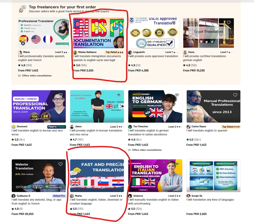
Contrast and Colour Choice Are Doing Heavy Lifting
Your thumbnail competes with every other gig on the same search results page. Colour contrast is one of the fastest ways to visually separate yourself.
![]()
Look at the first page of results in your category right now. Note which colours dominate. Then deliberately choose something different.
If your category is flooded with blue-and-white thumbnails, try a warm amber or a deep green. If everyone is using dark backgrounds, try clean white with bold typography. You are not trying to be garish, you are trying to be distinct.
One combination that has worked consistently well for me: a clean off-white or very light background with one strong accent colour for the text and a simple icon or personal photo. It looks professional without blending into the crowd.
Avoid using more than two or three colours in one thumbnail. More colours usually mean more visual noise, which makes the image harder to process quickly.
Show the Output, Not the Process
This is a concept I borrowed from product marketing, and it works extremely well for Fiverr thumbnails.
Do not show a picture of someone typing on a laptop to represent your writing service. Show what the finished product looks like, a screenshot of a clean, well-formatted article. Do not show design software to represent your logo work. Show a finished logo on a professional mockup.
Buyers are buying a result. Your thumbnail should show them what that result looks like.
For writing gigs: a clean document screenshot, a formatted blog post layout, or a mockup of your writing in a website template. For design gigs: finished logos on brand mockups, Instagram posts displayed on a phone screen, business cards in a professional flat-lay. For video editing gigs: a before-and-after frame split, or a clean video timeline screenshot showing polished editing work. For data or spreadsheet gigs: a screenshot of a clean, well-structured Excel or Google Sheets file.
The before-and-after format deserves special mention. Splitting your thumbnail into two halves, rough or unedited on the left, polished result on the right, is one of the most click-effective formats in categories where transformation is the product. Video editing, photo retouching, copywriting rewrites, and resume makeovers all work extremely well with this approach.
Gig Image Ideas by Service Category
If you are staring at a blank Canva canvas and are not sure where to start, here are specific ideas that work for common categories.
Content Writing and Blogging: Clean white background, bold dark font stating your niche specialty, your headshot in the upper right corner, and a subtle blog post screenshot in the lower left as a background element. Simple, professional, immediately clear.
Logo and Graphic Design: Show three or four of your best logos arranged cleanly on a white background. No clutter, no decorative frames. Just the work itself. Let the quality of your designs do the talking.
Video Editing: A split-screen thumbnail showing raw versus edited footage works well here. Or a clean screenshot of your editing timeline with a polished final frame shown prominently. If you have done work for recognizable content types, YouTube vlogs, product ads, or real estate tours, a still from one of those edits can communicate your range immediately.
Social Media Management: A phone mockup displaying a clean, well-designed Instagram grid. Tools like Mockup World and Smartmockups both offer free phone and device mockup templates. Drop your sample content into the mockup, and it looks immediately professional.
Translation Services: Two flags side by side, clean text showing the language pair, your headshot, and a clean document element in the background. Clear, trust-building, easy to understand in half a second.
Data Entry and Virtual Assistance: A clean spreadsheet screenshot or a simple to-do list with check marks. These are not glamorous, but they communicate competence and organization, exactly what buyers in this category are looking for.
Voiceover: A soundwave graphic, a professional microphone image (from Unsplash, free to use), your name, and a one-line description of your voice style. Audio is inherently visual on Fiverr thumbnails; buyers want to see equipment that suggests quality.
The Tools I Use, All Free
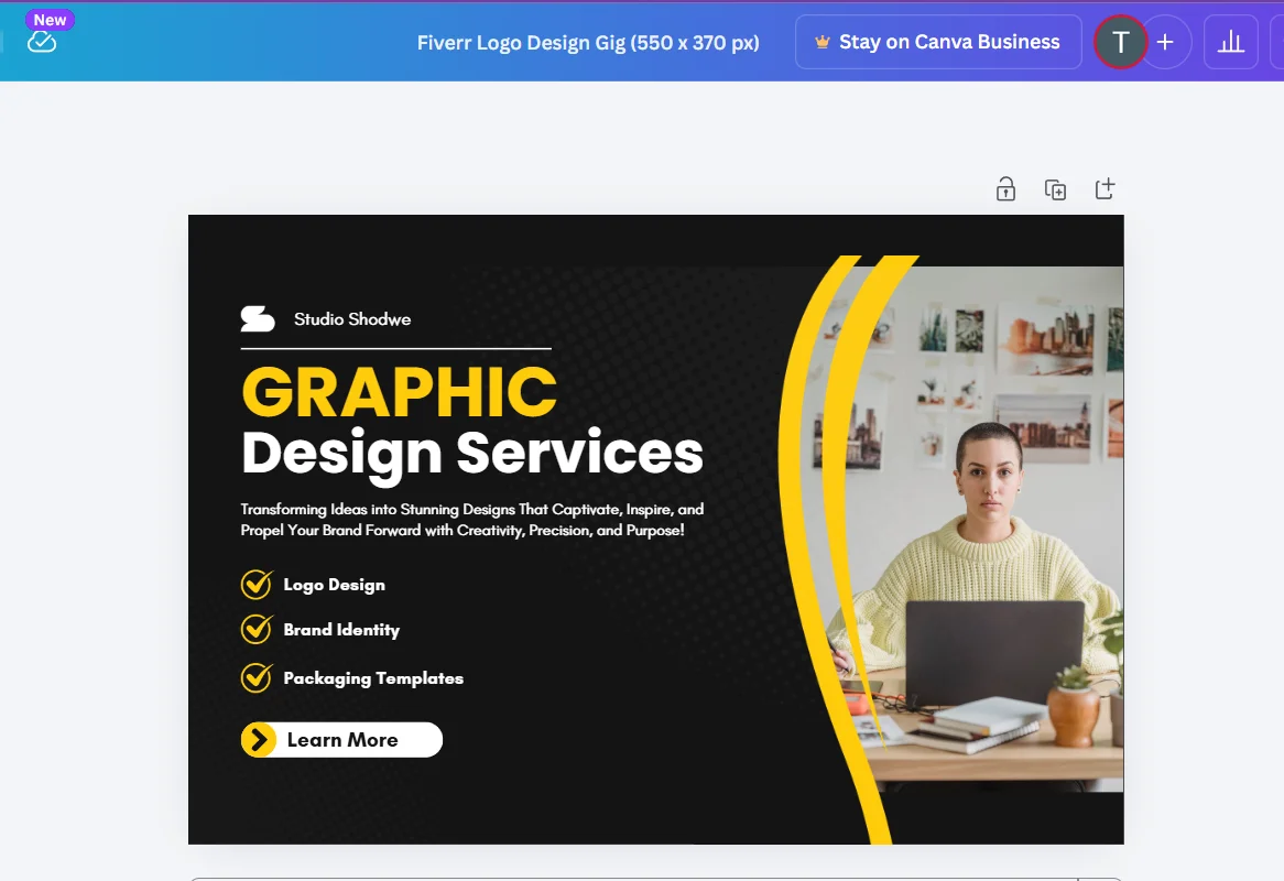
Canva (free tier): This handles 90% of what any Fiverr seller needs for thumbnails. Use the custom dimensions option and set it to 550 × 370 pixels, the exact size Fiverr recommends for gig images. Browse the free elements library for icons and shapes. Stick to free-tier fonts that are bold and clean; Montserrat, Poppins, and Raleway all work well.
Unsplash and Pexels: Free, high-quality stock photos with no attribution required. Use these for background elements, device mockup photography, or workspace imagery. Search specifically for what you need: “laptop workspace,” “notebook desk,” “microphone studio”, and you will find professional-quality images immediately.
Smartmockups (free tier): Puts your design work inside realistic device and product mockups automatically. Upload your design, choose a mockup template, and download the result. Takes about two minutes and produces images that look far more professional than a flat design screenshot.
Remove.bg: Free background removal for your profile photo or any image you want to isolate. Useful for dropping your headshot onto a clean, coloured background in your thumbnail without needing Photoshop skills.
Mistakes That Are Quietly Killing Your Click Rate
Using a logo or business name instead of your face. Buyers want to hire a person, not a brand. Especially when you are starting and have no brand recognition, a face builds trust faster than any logo.
Designing for how it looks on your screen, not in search results. Your thumbnail appears at roughly 200 × 130 pixels in Fiverr search results on most screens. Design at full size, then zoom your browser out to 50% to preview how it actually looks to buyers. If the text is unreadable at that size, make it bigger and bolder.
Using copyrighted images without checking. Do not use Google Images as a source for your thumbnails. Images found through a Google search are almost always copyrighted. Use Unsplash, Pexels, or Canva’s own free element library; these are explicitly cleared for commercial use.
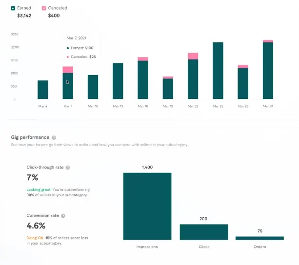
Never update your thumbnail. If your gig has been live for three months and your click-through rate is consistently low relative to your impression count, your thumbnail is probably part of the problem. A/B test a new design, run it for two weeks and compare the click data against your previous average. You might be surprised how much a single visual change shifts buyer behaviour.
Designing the thumbnail last. The thumbnail should be one of the first things you create when building a gig, not the last. Starting with the visual forces you to clarify your message early; if you cannot describe your service in six words for a thumbnail, your gig description is probably too vague.
One Last Thing
Your gig image does not need to be a design masterpiece. It needs to be clear, specific, and visually distinct from whatever else is on the search results page when buyers look for your service.
Spend an hour on it. Use the tools above. Put your face in it. Show the result, not the process. Make the text readable from across the room.
Then check your analytics in two weeks. The click-through rate will tell you everything you need to know, and if the number goes up, you will understand exactly why.
Disclaimer
Always check Fiverr’s latest image guidelines and licensing terms before using third-party graphics or mockups commercially.
If you want to learn about how to earn money by Fiverr Gigs, read this guide: How to Turn Fiverr Gigs into Passive Income Streams in 2026.
Taha Sohail is a professional blogger and cyber engineer with hands-on experience optimizing Fiverr gigs across multiple service categories. He writes practical, experience-based guides for freelancers who want results without wading through generic advice.


3 Comments on “Fiverr Gig Image Ideas That Increase Clicks and Orders in 2026”